Have you ever felt like a brand spoke to you just through its packaging? That’s the power of well-crafted packaging. Far more than just a box or a bottle, packaging becomes an emotional channel, a tangible story, and a living extension of your brand’s identity.
In this article, we explore how to create a coherent and memorable brand experience through packaging, examining two brilliant examples: Lolaletost, a sustainable children’s brand, and Orangina, the iconic French soft drink that won hearts with its bold and unconventional bottle.
Purposeful Packaging: Lolaletost and Tenderness Turned into Design
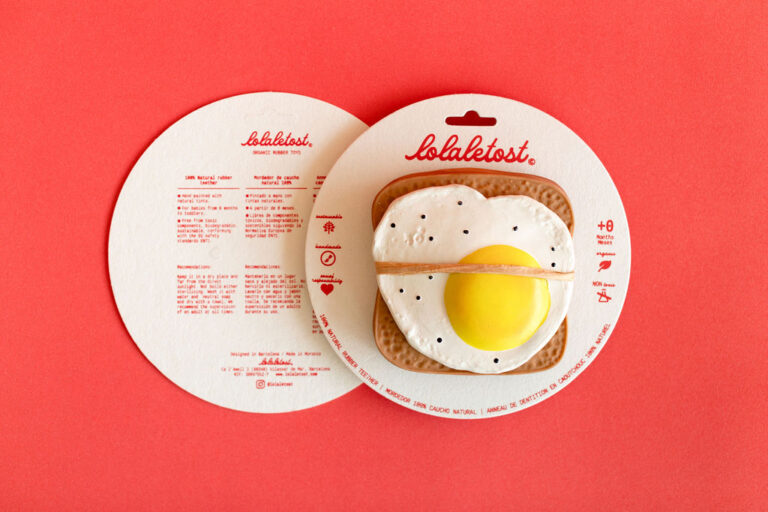
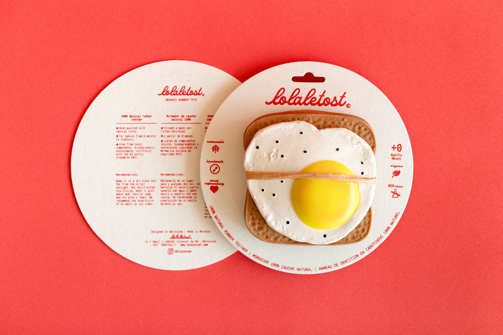
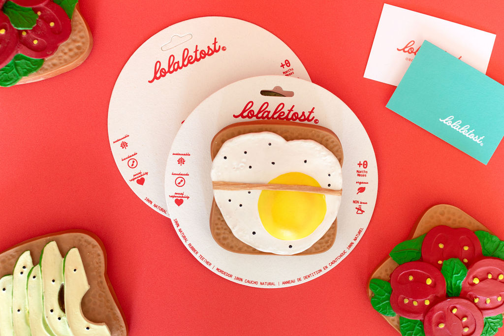
The brand Lolaletost, developed by the creative studio The Visual Corner, is the epitome of how thoughtful design can foster emotional connection. Products made from natural rubber, designed for babies and children, are presented in packaging that breathes sustainability and sensitivity.
From the use of recyclable materials to a soft color palette and charming illustrative elements, everything in Lolaletost’s packaging gently whispers, “we care about the future.” This coherence between what you sell and how you present it is not just aesthetic—it’s strategic.
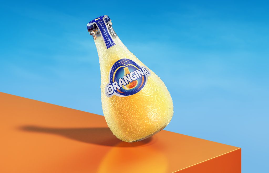
The Orangina Case: When the Packaging IS the Brand
Now let’s move on to a fizzier example. Would you drink Orangina from a can? For many fans of the brand, the answer is a firm no. It has to be in that bottle—that textured orange shape, that quirky, playful form.
What we can learn form Orangina and Lolaletost packaging design?
-
- Weird is memorable: Its bulbous shape and bumpy texture break away from the ordinary. It might not fit neatly on the shelves, but it definitely sticks in your memory. In the case of Lolaletost, the plate-shaped packaging is not only “obvious,” but it also invites play, encourages reuse, and is easy to display at retail points.
-
- Staying true to the vision: Jean‑Claude Beton, son of Orangina’s founder, stood by the bottle design despite criticism. He knew that the bottle was the brand. In the case of Lolaletost, its packaging has been widely praised for being fresh, original, and practical. It’s printed with child-safe natural inks and made from recyclable cardboard, all designed to minimize unnecessary waste.
-
- Brilliant simplicity: Orange on the inside, orange on the outside. A total visual coherence that shouts, “this is who we are.” In the case of Lolaletost, a simple plate-shaped packaging for a toast-shaped toy has proven to be a brilliantly straightforward idea—perfectly aligned with the brand’s values.
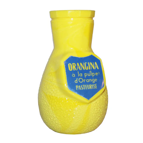
🍊 Fun fact: The very first design was called “Naranjina.” It was shaped like a perfume bottle and came with a tiny vial of lime juice on the cap! (Scroll down to see the photo)
Gold lessons: What Lolaletost and Orangina show us about packaging
| Design keys | a practical lesson for your brand |
|---|---|
| Visual Storytelling | Every element of design must be aligned with the brand message and purpose. |
| Iconic design | It’s ok to be different if is coherent with your brand. |
| Be coherent | Your product, packaging and brand experience must speak the same language. |
| Sensorial activation | Think about the textures, colors, materials, scents and even weight of your packaging. Every detail is part of your brand experience. |
| Break the rules with purpose | Sometimes, what looks like the weird or must obvious solution is what makes you special. |
5 keys to design a memorable packaging
-
- Start with the “why”: Don’t design what looks pretty first—design from what truly matters.
-
- Differentiate yourself: Use textures, colors, forms to generate sensory experiences and memories.
-
- Don’t sacrifice what’s essential: If your packaging communicates something vital, stand by it.
-
- Design an experience: It’s not just a container; it’s an invitation to engage with your brand.
-
- Reinforce your narrative: Packaging should amplify what your website, social media, and product already say.
Conclusion
Both Lolaletost and Orangina remind us that packaging isn’t an accessory—it’s a spokesperson. In saturated markets, where everything competes for attention, a distinctive, coherent, and emotionally resonant package can be the key to turning curious shoppers into loyal fans.
So next time you think about packaging, think about experiences.
Do you have a packaging project that deserves to tell a story?
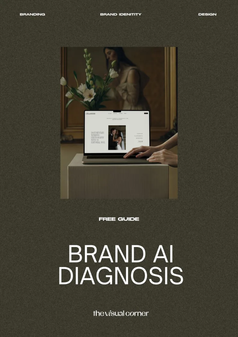
At The Visual Corner, we help bold brands transform their vision into a visual identity that truly shines. From our studio in Barcelona, we work with you to create packaging and branding that’s meaningful, beautiful, and full of purpose.
Let’s chat — schedule a call here.
P.S. If this approach resonates with you, let’s talk! Want me to review your current packaging or help you design something your community will never forget?